

Sometimes they get it totally right...

...And other times they get it completely wrong.
So, how on earth do advertising companies and studios make sure each poster they put out for whatever potential masterpiece or crap-fest looks golden and sells the picture? Well here's how.
1. SIMPLICITY
All the best movie posters are simple; they usually consist of a single or core image with minimal text. The image is all the poster needs to sell the movie and that doesn't mean it has to give a single plot point or theme away in the process. Here are some examples of perfect one-sheets:


These posters offer enough to spark intrigue or an idea of the picture without spoiling or amounting too much within the potential spectators mind. Just because they are simple does not make them boring to look at either - the American Beauty one-sheet is one of the most recognisable film images in recent history and one of the best looking posters too.
2. PRECISION
Overly wordy or quote-smothered posters can detract from the core of the film poster and make it more of an essay than a tantalisation for the eye. Sometimes large amounts of quotes work in a film's favour and they do certainly boost excitement for audiences but a cooler, more direct poster needs to be released and established before a text-heavy version. Keeping film posters précised and to-the-point will only make them more successful and have longevity; after all, if you are to stick one on your wall, you want it to be a sweet picture rather than a list right? Take these two posters for Buried for example:

The simply brilliant and atmospheric teaser.

The quote-smothered and distracting second theatrical poster.
Even if the second option gives you more to look at, it lacks the tension and certainly the intrigue of the former. The teaser poster really hypes up the suspense for the film and by the time the one sheet came out, audiences could really get a taste of the horror the movie presents:

The original one-sheet.
3. SELL YOUR STRENGTHS
I know this sounds ridiculously obvious but allow me to explain - so many movie posters do not sell themselves because they are unaware of what they actually need to sell. If it's a horror movie, you need to sell the fear whilst if it's a picture built around a star, the poster needs to sell the person. A Brad Pitt film is sold as a Brad Pitt film, not a feature with Brad Pitt, the film is secondary to the star, whilst something like Paranormal Activity is supposedly selling an experience, an atmosphere, so consequently the poster must portray this. Look at some examples of film posters starring Brad Pitt and see if you can see a theme:


In every single poster, Brad's name appears before the title of the film, the co-stars and the director. Even Terrance Malick's The Tree of Life which is as experimental as they come still opts for the technique to sell the star. Now if we look at some posters for horror movies including Paranormal Activity, it's a very different story:

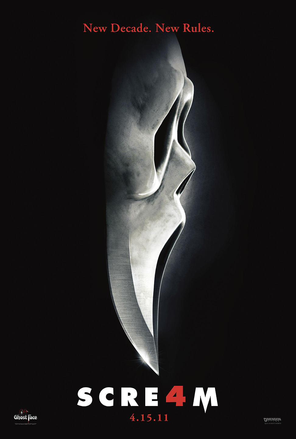


All these posters sell a theme or an idea and in doing so, enlighten the audience with brief nuggets of information. Even a film like Scream 4 which is loaded with stars still opts for a classic image rather than a bogged-down cast poster.
So taking all these things into consideration, here are some of the best posters from 2012 so far...


...And the worst.


CLASS DISMISSED.
No comments:
Post a Comment